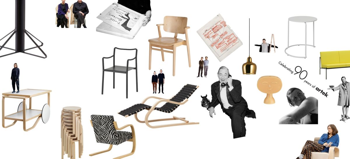
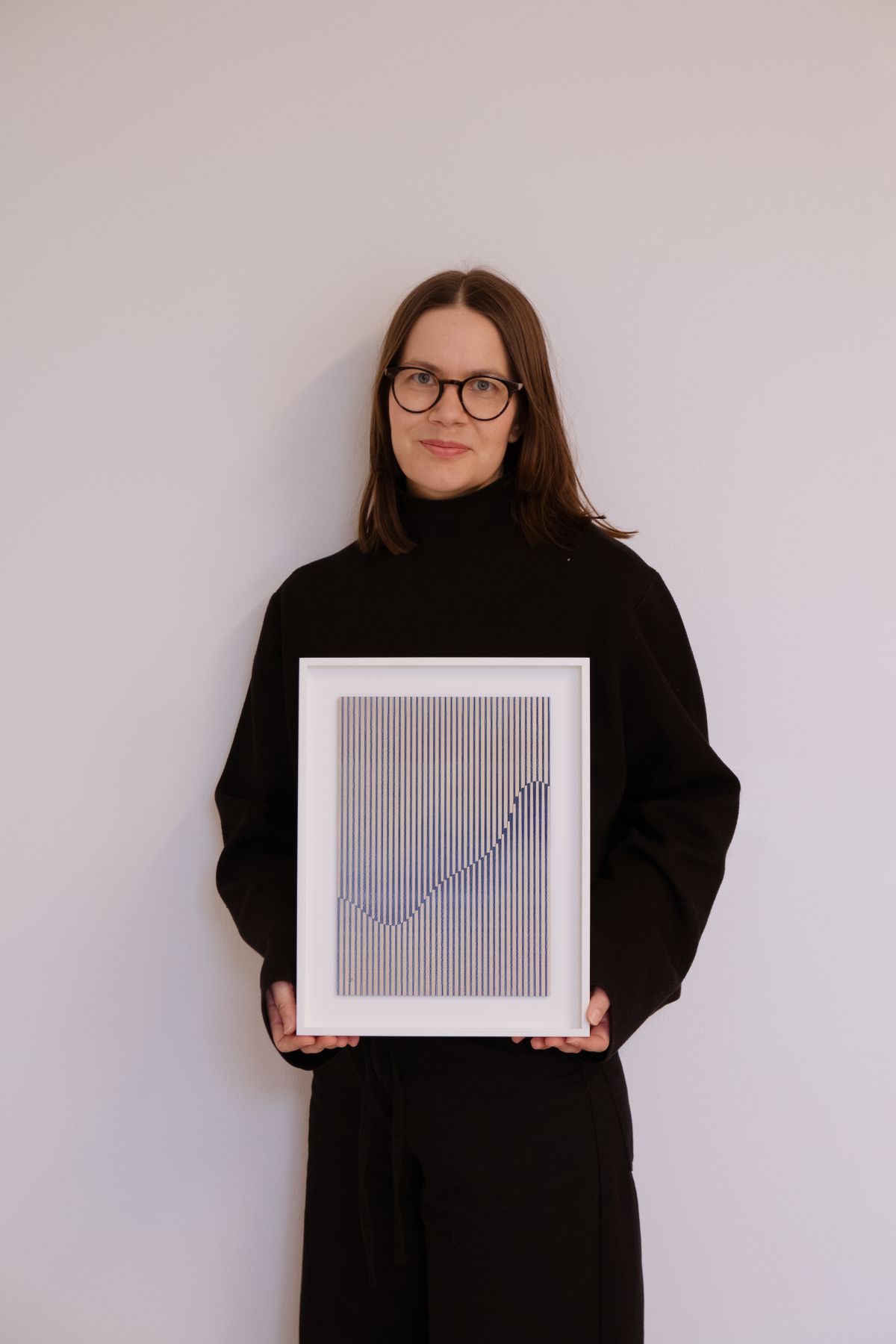
After apologising to Inka Bell for the early hour, I pause to admire the impressive array of prints on the wall of her studio behind her, suggesting an alternative career as an exhibition organiser awaits. She swivels the camera to reveal the surrounding mess of boxes, machines, tools and materials: ‘That’s the only part that’s vaguely presentable – it’s way too small for what I do!’ One tower of paper rising from the floor alongside her is an abandoned sculpture: ‘I stopped doing it maybe two or three years ago, but it’s still there, because where else would it be? Maybe I’ll get back to it at some point, I’m waiting for the right moment.’ Hopefully, that opportunity may be approaching – she has just completed her latest project, a poster for Artek’s ninetieth anniversary.


JJ: The relationship between art and design has always been a key part of the Artek story – it must be pleasing to find your own slot! How did the collaboration come about?
IB: My background is as a graphic designer – I co-founded a studio that still works with Artek, but left to concentrate on my artistic practice. I always appreciated the company’s aesthetics and values, and enjoyed working with them. A while ago, I held two exhibitions at Artek stores, and the relationship felt easy. Most of Artek’s furniture employs simple shapes – circles, squares, whatever – and that overlaps with the geometric forms in my work. And there’s also a shared focus on natural materials, even if I’m exploring paper rather than wood.
JJ: The Aaltos and their works are often presented as somehow ingrained in the Finnish way of life, in the country’s psyche.
IB: Yes, when you grow up here, you can’t avoid them! You may not have their furniture at home, but you still encounter it in lots of public spaces such as libraries. On one level or another, their approach and aesthetics – a particular way of understanding – are built into us Finns. For me, perhaps, it’s also about studying materials, and seeing what you can do with them on a practical level, shaping them, making things, seeking a certain simplicity.


JJ: So how did you make your move from graphic design into art?
IB: From the outset, I was more interested in printed materials than online work – I’d start thinking about which colours worked with particular shapes, and which materials and techniques could bring them to life. My language is very minimalistic, so those relationships are key – a black square can look completely different depending on the material, and would go to waste with the wrong one. Many techniques that were once used by commercial printers, and were key to the printing industry and to the spread of information, are now all but obsolete – stone lithography, screen-printing, letterpress printing and so on. As a graphic designer, you are still taught many of them, but today they’re used pretty much only by artists. In the course of my studies, I found myself intrigued by these techniques – they felt very natural to me – and during my maternity leave back in 2015, I realised that I wanted to get to know them better, so I made the switch to fine art.
JJ: Did it feel like you were stepping back into graphic design when you accepted this commission?
IB: It could have been problematic, but we had an open discussion at the start about where the line falls between an artwork and a poster. We agreed that the result would need to be in line with my practice as a visual artist – my work is abstract, rather than an abstraction of a subject. We tested a few different approaches, and it turned out to be surprisingly easy to find a route in. The graphic language of Artek is based on high contrast, on shapes and colours, so it sits comfortably with my practice. I’m really happy with how the final piece worked out.

JJ: Where did the idea of using Screen 100 come from?
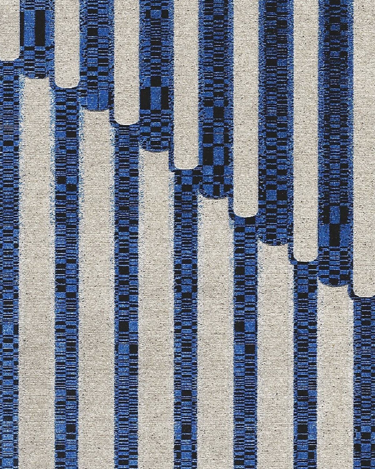
IB: I was thinking about Artek’s products, and about my usual starting point for artworks, looking for something that would provide a simple-enough shape, yet still suggest a product. I played with a few ideas, and at some point I realised that Screen 100 had the right qualities, and also suggested the Aaltos’ wider body of work. So the core idea, the wave in the poster, has been there pretty much from the start, and the blue colour, like the black, felt like a strong Artek colour to me – I even have a glazed tile from an Aalto building somewhere in my studio, which I’ve kept for inspiration. Then I started to play with the difference between foreground and background – if you look closely at the centre, some sections are in front and some in the back – and when things clicked, that was really great.
JJ: So there’s a three-dimensional aspect to the original artwork?
IB: I started out studying fashion design, but found myself more attracted to the images of clothing than the clothing itself. So that play between the two dimensional and three dimensional has always intrigued me. For an exhibition in Helsinki, I was wondering what else I could do with the laser machine sitting in my studio, which I’d been using for my paper sculptures. Then I had the idea of combining it with analogue screen-printing to create the pieces for the show. So when it came to the artwork for this poster, I employed that same technique, first screen-printing layers of ink, then engraving parts of the ink and paper away with the laser. Of course, the size of the indentations is zero-point-something millimetres, but if you get up close you can see and feel them – in the final poster, there is still this slight shadow, and that same sense of depth.
JJ: It sounds like quite an intense process! It’s interesting how the visual language in your work is quite straightforward – even minimalistic – yet the creative process behind it is complex.
IB: Yes, it’s very slow, there’s a lot of trial and error, manipulating settings, moving stuff half a millimetre, and seeing how it works out. If you take my paper sculptures, for example, they have been referred to in some interviews as painterly. The process of making them reminds me of weaving, with elements in the foreground and background. And it can be very frustrating to spend weeks on something that doesn’t work out – you might have a particular idea or image in your head, but it gradually becomes clear that it isn’t going to go as planned. But then it’s the nicest feeling when you discover something that’s actually better than what you had in mind – it’s so rewarding when you find something new, or a fresh way to combine materials or techniques.
JJ: As someone who isn’t comfortable talking about techniques, you’re refreshingly open about your practice!
IB: Yes, I always notice in interviews that I talk more than I should! It can be a problem, as I don’t want to focus too much on technique – although, they’re a crucial part of my practice so do tend to come up. And I don’t really mind other people making their interpretations of my work – for many artists, narrative is crucial. But for me, it’s purely about the practice, about the visual aspect; it’s just the way I do art, for its own sake. At the moment, I’m creating hard-edged and geometric images with the computer, and that visual language works quite naturally with printmaking. If I were painting, I think my language would be quite different – I’ve tried it a few times, and my hand wants to do something else, the line wants to be more alive.

JJ: Might you make a change at some point?
IB: I’ve been thinking about this a lot lately. I do feel that it would be nice if I weren’t too married to a specific technique – there are hundreds I’d like to try. And when I’m developing public artworks, I focus on materials and techniques that can survive in the Finnish winter, or occasionally in schools where kids can touch them. But on the whole, I’m still happy exploring all the possibilities offered by the tools that are around me now – and they’re definitely the ones I’ll be turning to when I develop my next exhibition.
That brings us back to the subject of Bell’s studio, and her hopes of finding a bigger one nearby – one that might, potentially, have room for a new poster. Despite the challenges of her current workplace, and the problems that it causes for her practice – ‘it’s like the backroom of some awful office’ – she views any relocation with trepidation: ‘It’s so much worse than moving home! I have so many materials, tools, artworks and machines here that I can’t just put into a box. I’d love to stay forever next time.’ Even then, the new space won’t be able to contain Bell’s practice: ‘I’m trying to have a clearer distinction between work life and family life, and 100 per cent it’s having a positive impact. But still my family can tell when there’s an exhibition coming, my mind is working 24/7 – I may not be in the studio, but it’s hard to turn off, I’m in a different world.’ And that seems an appropriate moment to leave Bell to her next project.